Introducing KarenHands Ministry’s Vibrant New Logo!
We are thrilled to unveil the fresh face of KarenHands Ministry with our brand-new logo! After much thought and creativity, we’ve captured the essence of our mission in a design that truly represents our commitment to compassion, support and community.
The Symbolism:
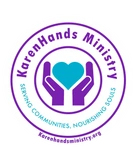
Our new logo features a pair of hands, reaching out in a warm embrace. This image symbolizes the heart of our ministry – extending a helping hand to those in need of comfort, and fostering a sense of belonging.
The vibrant colors used reflect the energy and vitality that radiates from our dedicated team of volunteers and supporters. It speaks the passion we have for making a positive impact in the lives of others.
Why the Change:
As we grow and evolve, it’s essential for our visual identity to evolve alongside us. This updated logo not only modernizes our brand but also better communicates the warmth, care, and inclusivity that we strive to embody.
A Heartfelt Thank You:
We want to express our deepest gratitude to our community, supporters, and volunteers who have been with us on this journey. Your dedication and commitment have made it possible for us to continue spreading kindness and support to those who need it most.
We hope you love our new logo as much as we do! It’s a symbol of our shared mission to make the world a kinder, more compassionate place.
With warm regards,
Karen Neal – KarenHands Ministry


